
Carebuddy by St. Joseph’s
Empowering Patients for Confident and Prepared Hospital Visits.
During my apprenticeship at the St. Joseph’s hospital innovation lab in New Jersey, I collaborated with my team and stakeholders to tackle patient confusion and uncertainty about appointment preparation.
Team
3 Product Designers
Sean Ferry (Director of Innovation, Project Stakeholder & Sponsor)
Jerome Wang (Innovation Strategist, Project Stakeholder & Sponsor)
Project Type
Healthcare, Mobile App
Tools
Figma | Figjam
Role
Lead end-to-end UX Designer and Researcher
Stakeholder Liaison
Research
My Role and Impact at St. Jospeh’s
Conducted secondary research, 10 user and expert interviews, along with 2 rounds of user testing, and synthesized insights into actionable design ideas.
Design
Communication
Led design sessions to translate insights into viable designs through high-fidelity prototypes. The final app reduced hospital administrative time by efficiently handling patient inquiries, enabling staff to focus on critical tasks.
Facilitated weekly stakeholder meetings, setting clear agendas and actionable goals. Led brainstorming and design sessions with the team, fostering collaboration that accelerated ideation and ensured all deliverables were met on time.

CHALLENGE
How can we equip St. Joseph's patients with clear appointment expectations to ensure they feel prepared and confident throughout their hospital visit?
SOLUTION FEATURES
Informative Homepage

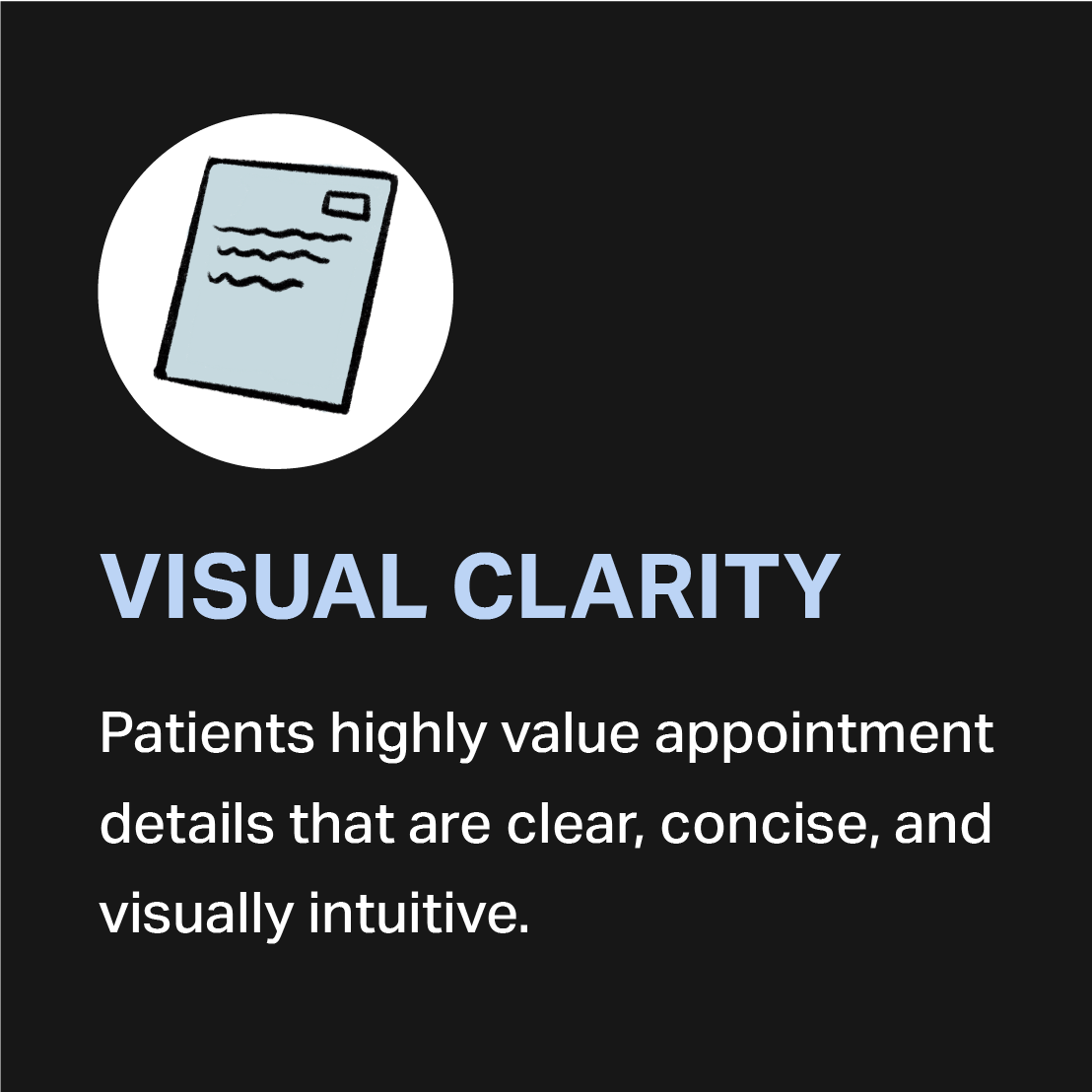
The homepage includes an appointment reminder, doctor listings, and essential patient forms, ensuring convenient access to vital information.
Appointment Checklist
A document checklist helps patients organize what to bring for their appointment.
Appointment reminders, including instructions for forms and medical test preparations, set clear expectations.
The checklist format ensures patients can easily track their prepared documents.

The reminder includes details such as appointment type, date, time, and location.
Color-coded cards correspond to hospital wayfinding sections, making navigation easier for patients.
Appointment Reminder Cards


In-app Chat Bot
A 24/7 chatbot instantly responds to patient questions, reducing confusion and providing support whenever needed.

We followed the 4D design process, iteratively refining our research & designs to meet users’ needs.
01
DEFINE
The challenge, project goals and the project scope.
02
DISCOVER
User needs through in-depth research and interviews.
03
DESIGN
The solution based on insights and user pain points.
04
DEPLOY
The solution and test with users to measure impact & success.
Define/
DEFINING THE PROBLEM
It can be difficult to navigate the healthcare system as there are several factors to consider such as providing insurance information, obtaining approvals, securing doctor referrals, scheduling appointments, and preparing necessary documents. Understanding this process can be time-consuming and potentially delay patients from accessing necessary care, leading to a sense of disconnection from the healthcare system.
DESK RESEARCH
We conducted desk research and analyzed statistics to examine various areas that may contribute to the issue. We found:

Nearly 39% of Americans experience anxiety before their appointments.
About 38% Americans have felt they didn't have enough information to help them prepare for their visit.

Discover/
FIELD RESEARCH
To conduct field research, we visited St. Joseph’s Hospital to gain a comprehensive understanding of our users' environment. During our visit, we observed the waiting times, familiarized ourselves with the procedures, and discovered that each building and floor of the hospital is color-coded. A wayfinding map is provided with these color codes to assist visitors. (pictured below)
USER INTERVIEWS
To dig deeper into user pain points, my team and I conducted 10 user & expert interviews, including 7 patients and 3 healthcare professionals from St. Jospeh’s (2 nurses and the Chairman of the Department of Psychiatry). Our interview goals were:
Identifying patient pain points and areas of difficulty in the appointment process
Gaining insight into how patients feel about hospital processes
Identifying communication gaps between the hospital and patients
INTERVIEW HILIGHTS


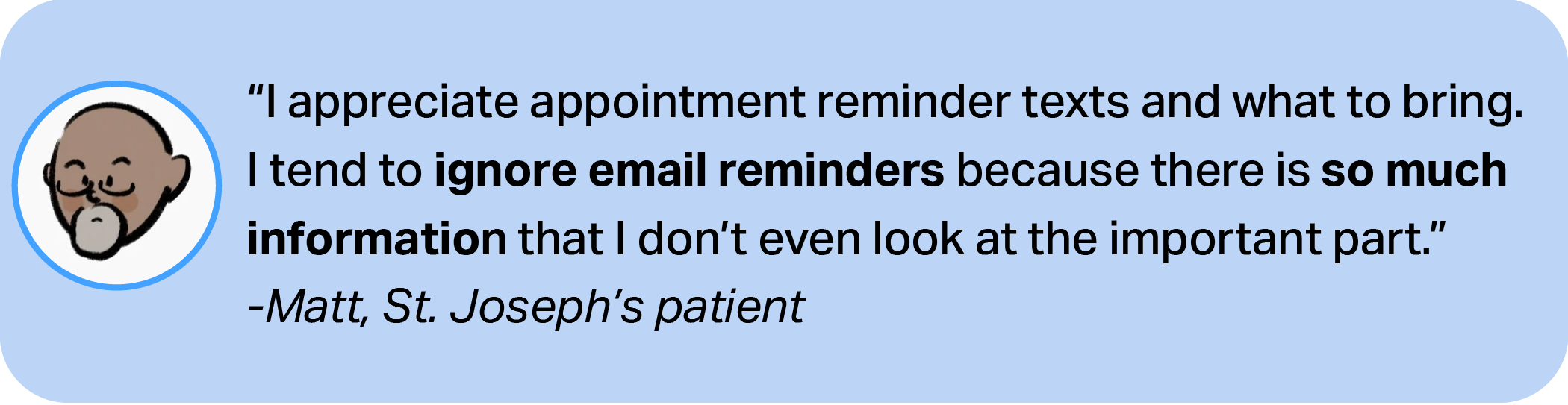

Key Insights/
Major takeaways from the user interviews included:


Design/
IDEATE
Drawing from our research and key insights, we began our app design brainstorming with methods like Crazy 8s. We then prioritized ideas based on the critical user pain points identified during interviews. User testing was crucial in identifying and ranking the essential features for our final product.


PROTOTYPING & USER TESTING
After conceptualizing the main app features, I created low-fidelity wireframes to test with our initial interview participants.
FINDINGS & IMPROVEMENTS
Deploy/
SUCCESS METRICS
The success of this app and it’s features were measured by:


KEY LEARNINGS
User-Centered Design Adjustments:
Through extensive user interviews and testing, we uncovered a significant gap between our initial assumptions and user expectations. This insight led us to rigorously question and refine our design, ensuring it truly served our users. By continuously collecting feedback at various stages and maintaining close communication with stakeholders, we successfully redesigned the interaction flow, resulting in a more intuitive and collaborative experience for hospital patients coming in for appointments.